We achieved a 200% increase in our client’s website traffic in 16 months. Learn More
xFor this episode of E Coffee with Experts, Matt Fraser interviewed Denise Pane, the founder and CEO of Access Design Studio. Denise is an expert in website accessibility and she discussed the importance of making sure your website can be used by everyone, regardless of ability. She revealed several powerful strategies to make your website more accessible. Watch the episode now to take your website to the next level while ensuring that it is accessible to everyone.
Part of building a powerful brand is understanding that a brand isn’t just your logo and something that looks pretty like it’s so much more than that.
Denise Pane
Founder and CEO of Access Design Studio
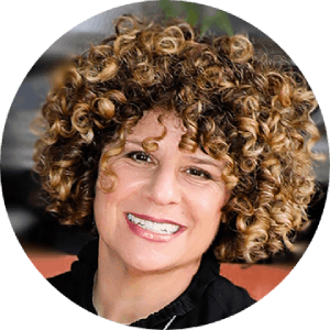

Hello everyone. Welcome to this episode of E Coffee with Experts. I’m your host, Matt Fraser. And on today’s show, I have with me a very special guest, Denise Pane. Denise is the founder and CEO of Access Design Studio, the leading expert in creating ADA-compliant accessible websites headquartered in Camino, California. She has a Bachelor of Arts degree with a major in psychology from the University of California and is a lifelong advocate for people with disabilities, starting with her own special Olympian brother. She is an Accredited Accessibility expert and a member of the International Association of Accessibility Professionals and the World Wide Web Consortium. When not building ADA-compliant websites for clients, Denise enjoys backpacking in the outdoors, kayaking in the South Fork of the American River, and spending time with her friends and family as well as her four dogs. Thank you so much for being here. It’s a pleasure to have you.

My pleasure. Thanks for having me. Matt.

Yeah. Hey, so how would your university professors describe you as a student?

That’s a great question. I would say exuberant, hard-working, social, and at that time, a little bit wild.

Right on. How would you say you’ve changed between then and now into the person that you are?

Not a lot. Still exuberant, still wild, and still super hard-working.

That’s awesome. Hey, what was the turning point that made you want to become an entrepreneur?

That’s a great question. And the reality is this was 22 years ago, I didn’t even know what the word meant. I was teaching high school in the San Francisco Bay area, and all I wanted to do was be on the South Fork of the American River kayaking.
And so, the guy who taught me kayaking said, hey, if you’ll come up and teach kayaking for me, I’ll have someone to tutor you in web design so that you can work on my Website, and I said the answer is yes. But what is Web design? Literally.

Oh, wow.

All I cared about was moving up to the South Fork of the American River, and then when I got into web design, working with clients in branding and designing, it was just the exact right fit.

Wow. That’s amazing. I mean, that’s an awesome story.

Thank you.

Hey, do you think there’s a lack of female representation in the digital marketing industry in regard to web design? And if so, why do you think that’s the case?

Oh, my gosh, you have the best questions. So, 22 years ago, when I started, our focus for about 20 years was women-owned businesses. Because of exactly what you said, I kept having women business owners coming to me and say, I tell my designer, I want this, but I get run over, and I’m not listened to, and so they just felt like their voice wasn’t heard. In 20 years, that still exists, of course, at some level, but it has changed so much because I just personally think the world will be a better place, the global economy, everything will be better when there’s more equal representation across all demographics. So, it has increased a lot in the last 20 years. There’s still room to grow. But I’m happy to say that women are much more represented in the industry.

That’s awesome. Hey, do you think there are any advantages that women have when it comes to entrepreneurship?

I do because we women tend to be a little bit more flexible and go with the flow and figure things out as we’re going and solve problems on the fly. Men do that as well, of course. But because just because of the way we’re thinking, there’s a lot of that. And I hope nobody is offended by this, but a lot more sort of heart-centered compassion and a lot of business owners want that infused in their brand.

Yeah. You know, my follow-up question was, do you think that it’s because women have more empathy?

Yeah. Thank you.

I don’t know if this is true for all women, but it seems to me that this is not the rule, or we don’t want to paint everybody this way, but for the most part, women have more emotional intelligence. I would say.

I would agree. And that’s part of building a powerful brand. Over time, people understand that a brand isn’t just your logo and something that looks pretty. It’s so much more than that. And so, as you said, women have that compassion and that empathy and that real heart-centered connection to the vision and the mission of businesses. So, we can use that in the brand sort of just more naturally.

Absolutely. I was my mother’s son, so I have that a little bit more than most men.

Bless your mom. Thank you, mama.

Do you have any role models or mentors who have helped you along your journey as an entrepreneur?

So many. I mean, the key to being a successful entrepreneur is finding those mentors that will sit with you, they’ll be eye to eye with you, will support you, they’ll tell you when you’re going awry, and they’ll share their deepest secrets of success. That’s a key, that level of trust. I’ve had so many, and I provide the same for up-and-coming entrepreneurs.

You just answered my follow-up question. But how do you find them, though? For instance, a lot of successful people are busy, so how do you find them? How do you find those relationships? Is it through LinkedIn or something?

Initially, of course, it was more in person, and for me, they’ve been women. I would go to NABO, the National Association of Women Business Owners. I became a member, and I went to their meetings, so for me, it was very in-person at first, and now it is by joining the groups. I’m very specific about the groups that I join and the business owners, the entrepreneurs, or whatever that are in them, then creating that relationship and then asking very straightforwardly, for me, it’s a very structured relationship, and then in terms of those that I mentor. I live in the Tyler area of California, and so I started with a business women’s networking group because we didn’t have anything. We were all having to drive over an hour down to Sacramento.

Oh, wow.

So I started a networking group in one.

You started one. That’s awesome.

Yeah, it has about 400 members, and then I started a business women’s mastermind. So, if it doesn’t exist, create it, right?

There you go. Yeah, absolutely. That’s awesome.

Thank you.

I was reading a book recently, the 12 Week Year, and it talked about the statistics of people who go further with someone and are on their own, like statistics, even people who were diagnosed with life-threatening diseases or conditions that if they didn’t change, they were going to die. And those who partnered with peers for accountability. Actually, we’re more upward to bring about change. So, do you also like having people that you meet with on a regular basis, not just mentors but maybe even peers in non-competing industries for goal accountability?

Absolutely, that is one of the key groups that I’m in is my peers. They’re making similar income levels. Because, you know, new level, new devil. So yeah, similar income level, similar drive, similar sort of thought leading, you know, etc. Absolutely, and it’s at least once a week, but usually maybe two or three. Many of us will meet as a group maybe once or twice a month, but we’re meeting individually all the time. That accountability, that like what is facing, that like, I’m losing my mind because of this struggle. Like I could not be where I am without that.

Wow. I’m so glad you share that. This book I’m not sure if you’ve heard of it, The 12-week Year. It’s a fascinating book. I’m going to be implementing the principles in my own life. And you basically plan your tasks. You don’t look at a year as a year anymore, you look at it as years, four weeks, and you plan out your goals. It could be like a specific goal of losing 20 pounds. But then what are you going to do is all the tactics you’re going to do in your backward plan to be in with the end in mind like he says, begin with the end of the mind, and plan everything out from there. Then every week, you meet with your accountability partners, and he talks about how you should have no more than 2 to 4. I would say four rather than two. I would say four people, in my opinion. I think any more than you get meetings are probably too long, but I found it fascinating, and I agree with you. I think I would have gone further in my entrepreneurial career if I had looked for a mentor like you’ve talked about and joined a mastermind group, if you will, in that regard. So, that being said, thank you so much again for sharing that. What inspired you to start web design? I know you talked about how this started, the Web design agency, meeting with the kayaking instructor, and all of that. But what was it about web design then that just you were like, wow, this is amazing.

So, again, this was 22 years ago. We’re working on a dial-up. There are no online classes, and I’m literally reading books to teach myself how to design HTML and all of that. And driving to Sacramento because there was a class somewhere. And I just found that I loved working with clients. It’s a very intimate connection when you’re creating their brand and their Web site and helping them see their vision, their mission, and their passion come through in their brand and in their website. That is what I love, it’s like you took my vision and you created it in a Web site or in my brand. I love that.

Yeah. It can be a lot of fun and a nightmare as well.

Well, absolutely. Anybody who’s been in business and worked with people knows that is true.

Yeah. Can you talk a little bit about ADA compliance and website accessibility?

I would love to. So, first of all, ADA compliance and accessible website are the same things. I just want people to know that first. In the US, we say ADA because we have the Americans with Disabilities Act, elsewhere you’ll hear accessibility. It’s the same thing. It basically means doing what needs to be done to a website based on the code level, on the first surface level, so that anybody of any ability can use the site as it’s meant to be used. But here’s the thing, when we think of ADA compliance or accessibility, we think of the physical part. That’s what comes to our mind. So, we think of somebody who’s in a wheelchair or somebody who’s blind or even maybe somebody who’s deaf. That’s what we think of.

Yes.

Digital accessibility has a much larger reach. It’s Massive. We’re talking about people with ADHD, people with dyslexia, color blindness, autism, epilepsy, and people with trembling hands, which is what we see in a lot of older adults that don’t have a disability. We’re talking about short-term memory. So, it’s a massive reach. It’s massive digital accessibility.

Wow. What made you decide to focus on becoming a web accessibility guru?

So, during the pandemic, I and so many others struggled with being cut off. We were cut off from those things that made life rich, robust, and memorable. As a matter of fact, it created a global mental health crisis.

Absolutely.

And so, you know, it just struck me that this is what people with disabilities experience every single day because the Web is largely inaccessible to them. They are cut off from buying tickets to the art opening or booking B and B etc. We even found that the Web site where you could register to get a vaccine was not accessible to people who were blind, like the COVID vaccine. They couldn’t register. So, this is the kind of thing that struck me because my brother is disabled. He is epileptic and developmentally delayed. He and my mom are the most important people in my life, and so I have a lifetime of experience. I was a Special Olympics volunteer for 20 years, and I worked in a special education classroom and I ran a camp for kids and adults with disabilities. So, it struck me. I mean, I have everything needed to make a change. I have a lifetime of experience with people with disabilities. I have a dynamite dream team of web designers, branders, marketers, etc. And from that, Access Design Studio was born, and we focus now on making the web accessible to everybody.

So, was it specifically the pandemic that made you focus on realizing that? Before that, was accessibility for you just something you didn’t know about? Because I know you’ve been doing this for a long time, like 22 years designing websites. Was it a wake-up call for you?

Absolutely. Well, here’s what happened. Matt, it’s like I kept hearing about this thing called web accessibility for years now. And I would reach out because I know many other web design agency owners because I’m a huge networker, as we talked about. And in 20 years, I’ve created a lot of relationships. And I would reach out, and invariably I would get some response like this, I’m not touching it with a ten-foot pole, it’s way too complex, etc. I kept hearing that, and so I was in that place of, like, how do I do it? Should I take it on? When the pandemic hit, it became so clear the inequity, and we were all on the web for everything. When I thought about people with disabilities not being able to have that lifeline, I was like, I don’t care what it takes for my team and me. We took a year, we trained for a year, and my developer trained for a year. It’s very technical and so we became accredited experts. I’m like, we’re doing this.

That’s awesome. Can you share an example of a successful website redesign that incorporated ADA compliance measures?

Absolutely. Do you mean the URL?

No, no. I think in general terms, like maybe you did something, but you don’t have to reveal it if you don’t want to. You know, maybe you did a site for a hotel or a resort or a hairstylist, or an astrologer or a plumber or someone like that, just in general terms.

Yeah. Many. If somebody wants to check it out because people think ADA compliance, it’s going to be ugly. They think that there’s going to be some monochromatic theme or something. First of all, you can check out my site Access Design Studio. It is fun, it’s vibrant, and it pops. And it is completely accessible. Another example is Reverie Retreat, revierieretreat.com. It’s a retreat center in the Sierra Nevada foothills. They’re closed right now because they are doing a bunch of building of ADA-compliant cottages, etc. But the website itself, it’s vibrant, it pops. You would never look at it and think, oh, gosh, this is boring. You would never know, except if you are disabled. Otherwise, you would absolutely know because it would be frictionless, or Skinner Vineyards they are a big winery. Their site is also ADA-compliant. And you can check these sites out. They’re gorgeous.

Yeah. I’m looking at it now. They are, and people can check them out too.

Yeah, and people with disabilities will have a frictionless experience because we know many things. One is, let’s hope we all want equal access, and as business owners or managers, we must consider ROI. Right?

Absolutely.

One of the huge things about an accessible website is, and we can get into numbers here in a second, that it’s providing that amazing guest or visitor experience. It’s frictionless. And we know that if anyone runs into friction, they leave. Gone are the days that we’ll try and figure things out on a website we take off. We’re going to find somebody who’s created a great experience.

Absolutely. So, what were some of the things that you redesigned in those sites, like the before and after stories? Like, take, for instance, Reverie Retreat. What did you have to do to that site in a redesign to make it compliant?

There are lots of things that need to be done on the code end. For example, making sure that if a screen reader is reading something, it’s telling them the same thing that a visioned person can use, for example, that it’s the navigation or that there is an expandable dropdown menu. So, it’s a lot on the code end and on the more visual end. Okay, I want you and anybody listening or watching to vision this with me, right? If you have a form, a lot of times, the name of the field of the form is inside the form box. So, it might say the name so that when you start typing, you put your cursor in there.

It disappears.

Yes, the word name disappears. So, think about this. If you have short-term memory issues if you have ADHD, or if you just get up to refresh your cup of coffee while you’re filling out that form, you come back, you no longer know what is supposed to go in that.

I know I’ve experienced and been frustrated.

And then you have to refresh or often erase everything you’ve done and start all over again.
Exactly. I mean, we all lose our minds in those moments.

I’m pissed off. Yeah.

Totally. The solution is you put the name of the form field above the box. So, when they click in the box, it still says their name. It’s a very simple but profound difference.

Yeah, I think the reason why designers and marketers started doing it, at least from my perspective, why I started doing it but stopped, is it just made forms look prettier.

It’s sexier. It’s true.

But I would rather now enable and provide accessibility than sexy. In that regard.

In that friction that you and I just talked about, that frustration. People are gone. They are out.

Yeah. So, what about other things? For instance, I see this happening, particularly in screen readers like the structure of the site when it comes to headings. For instance, going from H1, H2, once you go from H1, H2 to H3, there’s no going back again to an H2 for the structure of the site because it’s not compliant, is what I’ve been told. I don’t know if that’s true or not.

It’s not true. You can go back to H2. H2 is going to be another subheading of H1, right?

Yeah.

So, let’s say we’re talking about tours in national parks, and there might be walking tours. That’s an H2, and then all of the H3 is all the information about the walking tour. Then there are going to be bike tours that can be an H2.

Okay. So, you can go H1, H2, H3, and then boom back to H2?

If it makes structural sense on that page. You can do that. Absolutely.

Interesting. Well, how do people find out what’s true and not true? Because I had somebody tell me that if I do that, it’s not ADA-compliant. And I’m like, that will make it a hell of pretty damn difficult. Like when you want to follow the structure of H1, H2, H3, and maybe H4, and then boom, back to an H2.

Absolutely. You can find it out in a couple of different ways. There are a couple of AI scanners that you can use, you know, that use artificial intelligence, which can address about 30% of some very basic accessibility issues. But they can help you determine if your structure is correct. Now, here’s the thing, Matt, thank you so much for saying that you were told something incorrect. There are so many people out there right now saying that they do accessibility because it’s the big keyword. It’s a hot market. Ask them, are you accredited? Like, what is your training like? There are just so many people, I don’t think they’re doing it on purpose, but accessibility is very technical. And your average developer, your average coder, your programmer is just not going to know. They’re not going to know what they need to know.

Yeah. So, apart from reading the legislation, that’s obviously what you could do, but none of us are lawyers, and then calling a lawyer to do that. So, in other words, what you’re saying is that training is important.

Absolutely. I had my diploma. My developer spent a year training and taking various classes.

You talked about accreditation. Where do people get that accreditation and training?

DEQUE university has some training modules. There are some very specific ones. Wcag, the web content accessibility guidelines, has some really good training modules. Is there a way that I can share some links?

Yeah, if you want just to throw them out there and tell me what they are, we’ll put them in the show notes.

Okay, great. Right now?

Yeah, sure.

Okay. I would have to look them up, Matt.

Oh, sure. So, you mentioned that I don’t know how to pronounce it DEQUE?

I’m not sure as well. I’ve only seen it written.

They should change the name of their university. But anyway, this university, Dequeuniversity.com, has some courses on web accessibility. And then you mentioned another thing through the web 3 consortium has a foundational online course that people can check out.

Yeah, there’s that as well. And that’s a really good free online course. And then others can really help your developer dig into the nitty gritty because it’s very technical. It does take a significant amount of time and dedication to training.

Okay. What are your thoughts on people who argue against or ignore ADA web accessibility?

Well, first of all, I understand why because there’s so much contradictory information out there, it’s technical, etc. And you are not doing your client justice, you just aren’t. I mean, 1 billion people worldwide have a disability, 1 billion with a $7 trillion spending power. In the United States, we have 61 million people with a disability, and they have a $654 billion disposable income. In the U.K, there are 14 million people, and in Canada, there are 6 million people with massive spending power. So, if you are ignoring accessibility, not only are you putting your clients at legal risk in the U.S., huge legal risk because we do love our lawsuits. But you’re also missing out on 25% of the market. So, you are not doing justice to your clients.

Wow. And that’s the thing. You know, I was sharing in a Facebook group about this, and people were dismissing it, saying it is not so big a deal. I’ve heard horror stories of people getting sued. And you just said it like Americans love lawsuits. I don’t know why, but man, you can get sued for looking at someone the wrong way.

Totally.

And, you know, I heard a lot of lawsuits coming out of California lawyers. They want to make money. I don’t think their motivation is to be a do-good. I could be wrong. I don’t know what they are thinking, but money obviously motivates people, so they are looking at this as an opportunity to make money. And I’ve heard horror stories of people getting sued, and yet people still dismiss it. Unless I’m mistaken like the penalty can be around, I don’t know what the minimum amount is, but I’ve heard of lawsuits of, like, $4,000.

Oh, my God. That’s a tiny amount. The lawsuits in the U.S. have increased by over 1,000% in the last two years. And you’re right, the majority of them come from about ten law firms, and it’s such low-hanging fruit for them. 4000 is a tiny payout. Now, most of them will settle outside of court. But then, once you get sued, you are a huge target to be sued again. So, you need to make your site accessible. So, what I always tell people is to skip the lawsuit.

Yeah, exactly. And don’t wait for the lawsuit to happen. Just stick to the lawsuit and invest that money ahead of time rather than having to pay the lawsuit and invest the money.

Exactly. Like you’re going to have to make your site accessible, so if it’s not today, it’s going to be as soon as you’re sued. This is what I tell people, Matt, be a leader because this becomes then part of your brand. We care about equal access, we care about everybody’s experience that then becomes part of who you are.

Yeah, absolutely. Hey, you know, there are services, there are plug-ins. Some people are pitching WordPress plug-ins. Even had somebody pitch me on LinkedIn, and I just don’t see how that can solve the problem. It’s so complex. I don’t know if there are any AI solutions out there that do it because it seems like a lot of work, are those so? Have you had any experience with those so-called solutions?

Yeah. Buyer, be very careful. Buyer beware, as AI can only address about 30% of accessibility issues. Now, these plug-ins are overlays, or there are a few that are big hitters, and they have their language making it sound like if you know what you’re looking for, you can read between the lines, but if you don’t, their language makes it sound like they’re making your site ADA compliant. They absolutely are not, and they absolutely cannot. These two wires can only address about 30% of issues. It takes a trained human. So, you’ve left 70% of the issues unaddressed. Thank you for bringing that up. IAAP, which you said, I’m a member of the International Association of Accessibility Professionals. They recently sent out an email, and I am not quoting them here because I don’t have it memorized. But it basically said we are aware that the dangers that these present because they’re making it sound like they make the site accessible. We are coming up with a strategy to address it, etc. If you are a digital marketer or a business owner or do not get sucked into that trap, read their reviews, and you will see one after the other that says, we thought our site was accessible until we got sued. 25% of lawsuits last year were against websites that had those toolbars on them.

Oh, wow.

Yep.

So I know you’ve talked about how complicated it is, but, like, what is it that makes a site accessible? For instance, you mentioned the forms in that way. But you also mentioned somebody who’s colorblind. So, what is it, for instance, of making a website accessible for someone who’s colorblind?

This happens a lot. Let’s say you have a calendar, right? You have a booking agent. And you’re going through the dates and all that happens like you’re on the 3rd of March and then you’re moving to the 4th of March and you’re moving to the 5th of March. If all that happens is that it changes color, right? Maybe it goes from a light green to a dark green to show where you are on the calendar. Somebody who’s colorblind may not be able to see that or go back to our form. You submit a form, and you get that nasty gram that says you have missed a form field. If all that happens is a red box comes around it, you know, that shows that this is the form field you’ve missed, but for somebody colorblind, that’s going to look like a shade of gray. Some shade of gray, and so they have no idea. We’ve all had that happen. You’re like, where is this? And then, you’re super frustrated. So, all that needs to happen is we put the word above it. The red box is fine; let’s leave the red box. But then you put a button above it, a little asterisk that says “required,” so that pops up if you’ve missed it. A simple but profound change.

Interesting. What about putting it in the label as well? Like all the time, asterisks are required.

That is great. As long as the only thing that you’re putting, you’re not just putting the gesture ‘read’ within the box.

You can put some kind of message. So, if you put that at the top label, the first name beside it, star asterisks are required. And then maybe if the mistake happens or they don’t fill it out, you could put a message under the bottom of the form field. Please fill this out, or oops, you missed this.

Yeah. Missing field. Whatever. As long as it’s not just a red box to show that.

What about other things like, for instance, color contrast with graphics? Like I know one, I say this not to sound arrogant, but I do have a diploma in web design. This is Edu, and it cost me a lot of money. You know, one of those techniques for web design was the use of hero images in the background and then putting a transparent color overlay over top of it. And you know, I tend to make my images black and white for hero images and then use the color overlay over the top. But are there any things people should look out for when doing that, or is that something that should be avoided entirely?

Contrast is a big one and affects a lot of people. A lot of people have low vision, and it also affects people with autism, with ADHD. I mean, all of these things are taken into account. So, there are color contrast ratios, and there are lots of free ratio checkers. You know, if you do a Google search for Google Color contrast ratio checker, they’ll come up, and you can check certain things. Now, you’re right. That sort of transparent text over an image that’s not great contrast or what we’ll find is, you know, a lot of times will have an image, let’s say you have an image of a hot air balloon over a city and then you have text over that. A lot of times the text will go, like you have white text. It might look great over the bright orange and red and green hot air balloon, but then when it goes over the sky, it might be a little too light, and it might not meet the contrast ratios. That happens a lot. So, you can even just darken that back area just subtly. I’ve done this a million times. Darken the back area of the image in photoshop or it can be that it’s that text is moving over the image. So, you might need to make it a different color. You do need to take those things into account to make sure that it’s sellable and usable for everybody.

Are there any online checkers that you prefer like that? And also, you mentioned that some of them get 30%, are there any others? Is there an online site that someone wants to know, they want to go and check their websites and see how bad it is, or a web designer wants them on an ongoing basis? Are there any chrome extensions for that? That you recommend that you personally use.

Yes, you can use something called Wave.

That’s wave.webaim.org

You’re exactly right. That’s a plug-in, an extension you can put on Chrome. And it’s fantastic. You were talking about your structure a little bit ago and your H1 and H2. They will help you out with that so that you can put in the extension, and then you just bring up any Website. You click on the extension, and it will show you a couple of its address’s color contrast. It can address your structure. Again, it’s AI, so it’s only going to get maybe 30%. But it’s really helpful, and I use it all the time. A lot of times, somebody will come to me and they’ll say, I don’t know if my site is ADA-compliant. And unfortunately, we’re sort of all hoping it is. Well, if you haven’t had discussions with it about your developer and you haven’t hired a trained developer. It’s not. But it’s a great tool to click on. I have the extension on my Chrome, and then it can tell me errors, it can tell me contrast issues, can show alerts, which like this, may not be a weak tag web content accessibility guidelines violation, but the best practice is to do this. So, it’s a great starting tool.

Right on. And what about it when it comes to SEO? Is SEO influenced by accessibility?

Yes. And this is another reason why marketing agencies or web designers are ignoring accessibility. They are not doing right by their clients. Because an accessible website is ranked higher by Google for a couple of reasons. One is 25% of the population has a disability, and of course, the legal, as we know, Google wants to serve up results that are usable and valuable by the largest number of people. An inaccessible website is usable and more valuable to 25% more people. So, of course, Google is going to say, well, yeah, I’m going to rank this site higher.

That actually makes sense.

One of the principles of accessibility, and this is one that the untrained person can do, is adding alt text to every image and not just a short description of an image. Google can read those. Google can read the alt text. Google can read transcripts of videos. So, if you have a video transcribed, Google can’t hear your video but can read your transcript and rank you for that content. So, there are just so many ways that accessibility helps SEO.

So for images, make sure you have your alt texts and not keyword stuffing while actually describing the image or what it’s about.

Exactly.
Google doesn’t like keyword stuffing, no matter what the reason for the end user and for Google. Google wants to see that every image has alt tags.

Yeah, absolutely. You know, I’m thinking of when I used to work for a car dealership, and they had, well, a minimum of 200 units of inventory in 30 pictures each. That’s a minimum of 6000 images. I have no idea how they would manage it. The number of man hours that would take for them to put in alt descriptions for each image, and they have inventory changing every day. It would probably take a full-time employee and merchandiser to be able to do that. I don’t know if there’s any other way.

Yeah. So, some of those plug-ins we talked about can address alt tags. But here’s the thing, I wanted to test one out, and it took me and my assistant longer to go and fix all of the crazy alt tags than you just to do it. That’s why one of the things that we offer is a regular accessibility review of a website. And we can fix those issues.

I know how the car industry works because they use inventory management systems with apps that have like you take a unit comes in, and I know because I designed the entire process. You take 30 pictures from start to finish from one side of the car all the way around to the other. And a plug-in would never do it because you literally would have to take those pictures, and it would be harder to do from an app. But I guess they would have to like then go and log into the desktop version of a site that IMS and go through those images and add. Unless the IMS themselves, we’re going to program it into the software to tell them to add that label automatically. But, I don’t see how because, like, if you’re taking a picture of the other front passenger or front driver’s side mirror, which you do. You’re going to have a 2018 Toyota Camry, front driver’s side mirror, you know.

Right.

Yeah. There’s no way I can figure that out.

Yeah, absolutely not.

Well, it’s been fascinating talking to you. What’s one big takeaway you want listeners to get from this episode?

I want listeners to understand that there are three prongs to accessibility. One is the quality and dignity of life for real human beings. Get in touch with our heart for a second, and I think we can all go, we do, actually. We want equal access. It’s worth the effort just for that principle. Quality and dignity of life for real human beings.

Excluding the narcissists that are out there. But yeah, I agree with that.

Exactly. And that there is our ally in website accessibility. Unlike, people think of that maybe $25,000 wheelchair ramp they had to build, which I still think is equal access for everybody. But I get that as a business owner, if you have a physical location and you put, whatever, 15 grand into that ramp, you’re feeling like you’re never going to get the ROI off of that. Well, digital accessibility is different. You’re talking about 25% of the population there is ROI. And then, we’re talking about diversity, equity, and inclusion as a huge include ability in that equation. We forget about ability. We think about gender, religion, and race as we should, but we forget about ability. But when we’re focusing on DEI, diversity, equity, inclusion, and sustainability, we must include ability and equal access.

Absolutely. Hey again, it’s been a pleasure having you here. How can our listeners connect with you online if they choose to do so?

Yeah, so you can go to accessdesignstudio.com and connect with me there. And I can hop on with anybody and do a video review like this of your site or of any site. I’m happy to show you kind of what’s going on in there. And then I’m on LinkedIn as Denise Pane or Access Design Studio both on LinkedIn. We’d love to connect with anybody. I want to answer anyone’s questions because my biggest goal is that everybody can have those experiences that make life rich and robust, and that does mean equal access on the web.

Cool. Thank you so much for being here. We will make sure to put that information in the show notes. It’s been an absolute pleasure.

It’s been such a pleasure, Matt. And you ask fantastic questions. Thank you so much.

Thank you. Have a great day.

Thank you.
