Table of Contents
- What is SEO Web Design?
- Best Practices For SEO-Friendly Web Design
- Best Practices for Mobile SEO
- Analyze site speed
- Make navigation buttons more explicit
- Make content legible without magnifying
- Provide automatic sign-in
- Add jump links
- Add alt text to images
- Ensure your content fits the screen
- Keep the pages lightweight
- Use HTML5 to code
- Provide a click-to-call button
- Keep the website architecture/navigation simple
- Best Practices to Design Website Architecture
- Avoid Duplicate Content
- How to Identify Duplicate Content
- How to Fix Duplicate Content
- Use Canonical Versions
- Best Practices for Using a Canonical Tag
- Work on your URL
- Best SEO practices for URL
- Focus on user experience
- How to provide a good user experience for
users and search engines - Make Pages Indexable
- Best Practices to Make Your Page Indexed
- Apply schema markup
- Improve Site Speed
- Ways to Improve Your Site Speed
- Content guide
- Information Architecture – Structure and Best
Practices - Conclusion
What is SEO Web Design?
Often, when the question “how to design a website” is raised, logo placement, mock-up reviews, photography, and user experience are a few of the most common answers. Search engine optimization is rarely a part of the list. It is perhaps because it is an afterthought for several organizations that are designing or redesigning their websites.
Indeed, there is already enough on the plate of those designing a website to focus on SEO, but when you lay the groundwork for the website to perform well on the SERPs right from the designing stage, it will bring great returns long into the future.
Therefore, if you are just starting, designing and developing the websites for both the user and the search engines is a recommended practice. This is where SEO website design becomes relevant.
What is SEO Web Design?
SEO web design is a practice that aids in improving website traffic by making them more indexable and accessible by the search engines.
You can have an appealing website but if you are not discoverable by your users, you won’t have any traffic. SEO web design helps in making your site more visible. It is a process of ensuring your website is designed in a way that attracts both users and search engine crawlers.
There are a couple of extensive practices for you to ensure your web design is SEO-friendly. Find these practices below.
Best Practices For SEO-Friendly Web Design
Below are the key practices to keep in mind when designing the website for the search engines.
Analyze your website in an SEO browser
If you want to see your website from the point of view of the search engines, it’s best to use an SEO Browser. One of the key benefits of using an SEO browser is that it will help you be sure that your website is completely crawlable and thus, indexable.
Just a little disclaimer, when you see your website on an SEO browser, it will appear to be different than how it would look on any other browser available at your disposal. Remember, it is the search engine’s perspective, not your end user’s.
Process of using an SEO Browser
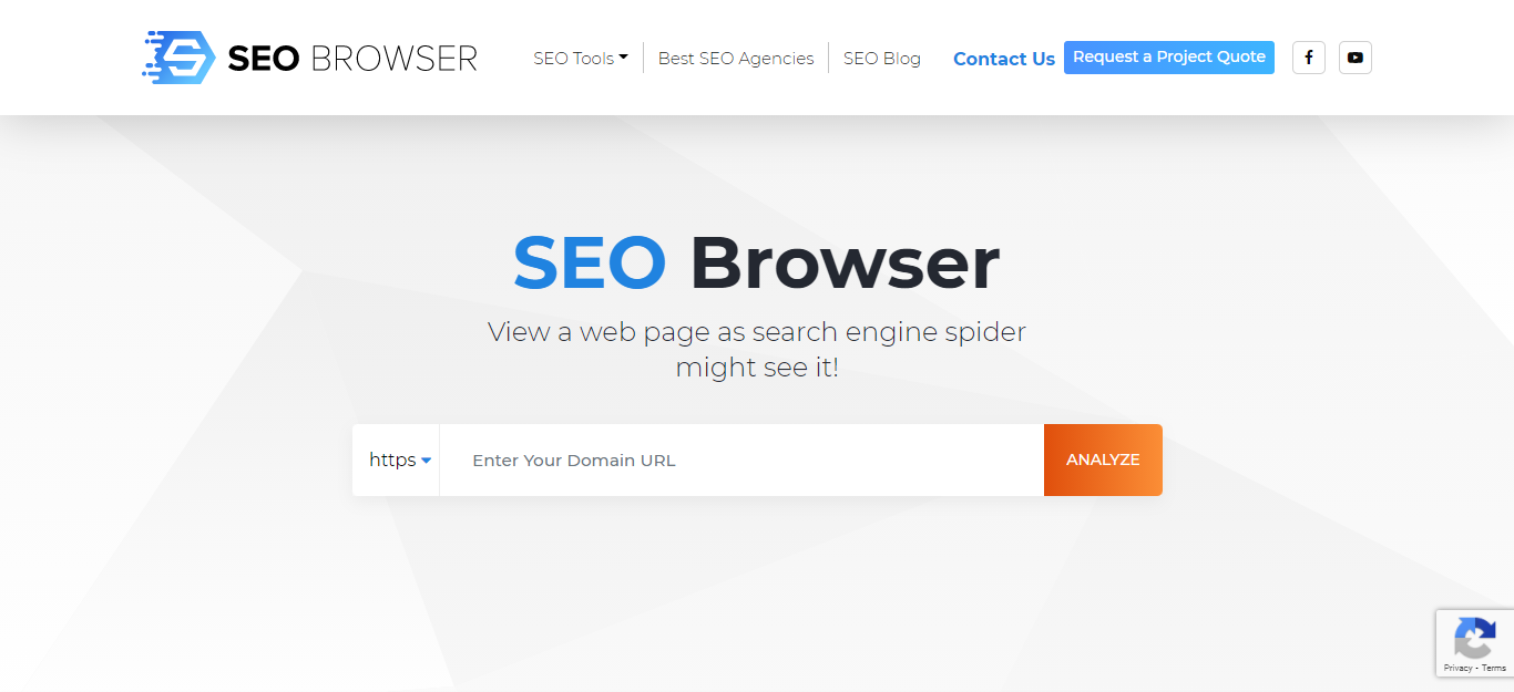
You can use the free tool named ‘SEO Browser’ for the same. This tool is perfect to see your website in HTML form.
All you have to do is go to your website and copy the URL. Paste your website link in the search bar and click on ‘Analyze’.
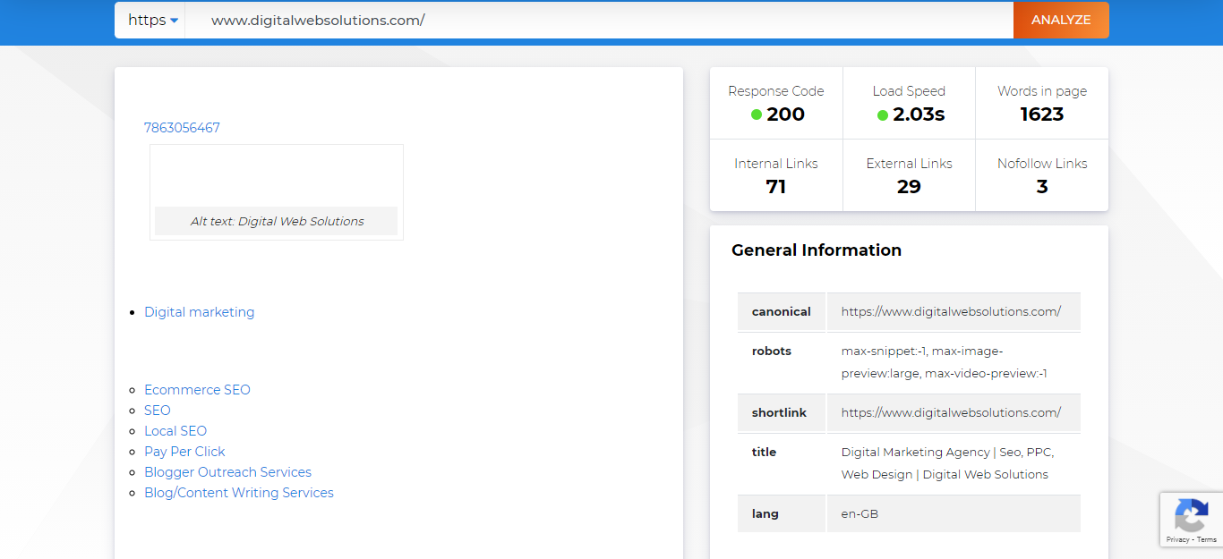
You will be directed to a page with your report compiled and displayed. You will now be able to see your website in the same way your search engine crawler views it.
If you have added alt texts to your images, the search engine crawler will take that into account and display it in your report. But if you have not added your alt texts yet, the boxes would be empty with the button highlighting that your alt text is missing.
If you come across elements that are not visible to you on the website, it means they are not visible to the search engine either.
You can take note of that and make sure you take the necessary actions to make them visible.
Make your website mobile-first
In recent times, we have witnessed a surge in the usage of mobile phones. Around 61% of users on the web use a mobile phone to visit and navigate websites.
Consequently, Google, the most commonly used search engine, is now shifting to the mobile-first index. This means that when a user enters a query and the search engine result page shows up, Google tailors the size of the SERPs according to the platform (the device) in use, making it easier for the user to navigate through.
To add to that, Google has also made mobile responsiveness one of the several ranking factors. Google favors those websites that are mobile-friendly. It only makes sense to ensure that your web design is mobile-first. It will help you prepare your website for both users and search engines.
Take this website by Shutterfly, for example.
This is the desktop view of the website. Since desktop offers more digital real estate, thanks to the landscape mode, the architecture of the website are stretched horizontally.
On the other hand, if you see its mobile web version, the site size has been compressed to fit the mobile screen but you can still access all the important elements of the website.
The users can easily scroll through the website and perform the desired task, irrespective of the device they are using. This offers a positive user experience that further helps in boosting your SEO.
There are a few key practices that should be taken into account when optimizing the website for mobile as well as the search engine and the user. The same is mentioned below.
Best Practices for Mobile SEO
1. Analyze site speed
The average mobile session lasts for about 72 seconds while a desktop session lasts for 150 seconds, which is more than twice. It means when a user is visiting a website from their mobile phone, they are often in a hurry, and waiting for the website to load is the last thing they want to do.
This indicates your website needs to load faster. If your website does not load within 2.5 seconds of the user clicking on the link, it needs major improvements.
There are a couple of speed test tools that you can use to test the current speed of your website. One such tool is PageSpeed Insights. All you have to do is enter your URL and you will have your website review along with the improvements that can be made.
Then, use a website auditor to analyze and identify if any of the added images or other forms of media are taking a prolonged load time.
2. Make navigation buttons more explicit
When you optimize your website for mobile, the size of the elements will get smaller. It means that if your navigation bar and buttons are not of the right size, it will be slightly challenging to access them. To add to that, touchscreens are anyway trickier to use than the mouse and a cursor.
The size of your navigation buttons should be large enough that they stand out when your user visits your website.
Also, if your navigation bar is set at the top for desktop, it’s best to shift it to the bottom. This is because when your user is done scrolling through the website and reaches the bottom, they should be able to easily go to the next page they want to visit.
3. Make content legible without magnifying
Another way to ensure your web design is prepared for mobile SEO is to use simple fonts and a large enough size of text. Your user should be able to read the content on your page without double-tapping on it or pinching it to zoom in.
To do this, you can arrange, style, and scale your text and other media according to different screen sizes by making changes to the CSS media query breakpoints, which are nothing but the points or values that designers define in CSS to ensure high resolution.
4. Provide automatic sign-in
Providing automatic sign-in is perhaps the most underrated mobile web SEO practice.
Automatic sign-in is when you offer ‘Sign-in with Google’ or other one-tap sign-in options to the users. This will offer a good user experience because adding data when using a mobile phone does get a little tedious.
It will save your users from getting frustrated.
5. Add jump links
Infinite scrolling has become a part of our day-to-day lives (thank you, Instagram!). When a user visits your mobile website, they are primarily looking for content, everything else is just secondary. And when they are in search of something, they won’t mind scrolling through infinite folds.
However, designers need to be careful when infinite scrolling is concerned to ensure it doesn’t hinder the user’s experience. One of the best ways is to add jump links wherever possible.
Jump Links allow your user to reach a particular section on the web page in an instant, without actually having to scroll up or down. This saves their time and effort while offering a good user experience.
6. Add alt text to images
Ironically, this is one of the most talked-about and yet, the most overlooked practice.
Adding alt text to your images is a great practice to boost your SEO as well as ensure your users have a good experience while navigating your website. It is a practice that can particularly benefit disabled users and make the website more accessible.
Often, the users with limited data that access the mobile web will have images blocked to minimize data consumption and also, to improve the load speed. When you add alt text, your user will be able to at least read about the picture and visualize it in their mind.
As for the search engines, they can’t read or see your image. Adding alt text helps search engine crawlers get better and more information about your website, improving the chances of your website ranking better.
7. Ensure your content fits the screen
One thing to consider during this process is the direction. We have already discussed in the example mentioned above (shutterfly.com) that the desktop has more space horizontally while the portrait/vertical direction can be seen on mobile phones.
It is the designer’s responsibility to ensure the content fits the screen. Your mobile user should not have to scroll horizontally to access a certain piece of content. It will instantly make them leave your website.
You will just have to edit a few tags and CSS style to make your website responsive and you are good to go.
8. Keep the pages lightweight
We have already discussed that you should ensure your website’s speed is fast. While a speed tool test is one way to understand the changes that can be made, another way is to avoid adding bulky ads or images to the website.
And let’s face it, no user really wants to see an ad anyway!
When you add heavy media, it can harm your user experience and the ranking on the search results. For mobile web, you should only add extremely important and relevant images.
Reduce the pixels, resize images, and use formats that are truly suitable for the web.
There is also a Web Light solution provided by Google that helps transcode your pages for those users that have a slow connection.
It improves the speed by four times and helps save data. You can majorly preserve relevant content and provide a link to the users that will direct them to the original page.
9. Use HTML5 to code
One of the crucial things to consider for your mobile website is that your content should render smoothly.
The good news is that this is possible by coding through HTML5. It is mobile-friendly and works across operating systems.
You must avoid using software that is not commonly used in mobile phones such as Flash. Such software will only add to a poor user experience.
10. Provide a click-to-call button
Inherently, mobile phones were created to make communication via calls more convenient and easy. So, adding a click-to-call button won’t be such a bad idea.
When a user uses a mobile phone to search, they often have a purchase intent.
Adding your accurate phone number with a clickable link to it will only help you improve conversions and offer a good user experience.
Making your web design mobile-friendly is among the best practices to boost your SEO and also to steer clear from any form of penalization by the search engine.
These were all the common practices that experienced designers use to make their website mobile-friendly.
11. Keep the website architecture/navigation simple
Before we get on with the details, let us first understand what website architecture is and why it is a crucial part of SEO web design.
Website Architecture is the blueprint of how your web pages are organized, structured, and linked together on your website. With the help of well-planned website architecture, you can make sure that your users and search engine crawler both can easily find what they are searching for on your website.
Interlinking your web pages allows search engine crawlers to find all the pages that are available on your website. However, if a certain web page is not linked to any other pages or is positioned several clicks away from the homepage, it will be challenging for the crawler to find and index that page.
Take a look at this sitemap below.
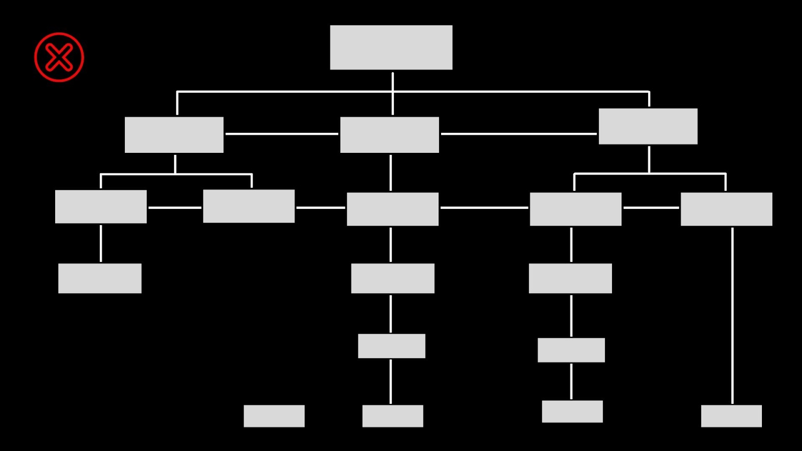
As you can see, there are two web pages that are accessible only after visiting several pages. T
o add to that, you can also see one of the web pages is not linked to any of the other pages on the website. It will be impossible for both the user and the search engine spider to reach here, resulting in the page not getting indexed.
Moreover, the site map is a little too complicated for the crawler to understand. Indexing such pages will be next to impossible for the bot.
Now, take a look at the simplicity of this website architecture given below.
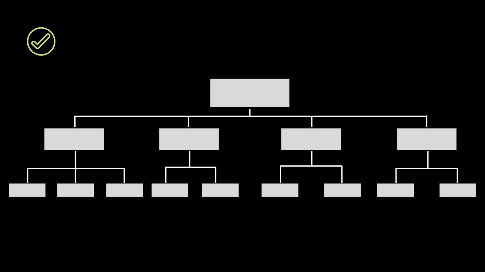
This is the kind of website architecture that makes it easier for the search engine spiders to crawl through all of your pages and index them.
But how do you design a website architecture that is SEO-friendly? Find out the best practices to keep in mind when designing your site architecture below.
Best Practices to Design Website Architecture
1. Keep it simple
Let us start with the most basic one.
The best thing about website optimization is that you don’t have to make things complicated. On the contrary, keeping things simple is the key.
Simplicity is especially an important factor to consider for those websites with more than a thousand pages. If you have a complicated website architecture, it will have a bad impact on both your SEO and user experience.
Such interlinking makes it challenging for the user and crawler to find what they are looking for on the website. But if you have a simple architecture with a well-structured hierarchy, it will make it easy to navigate through your website.
All you have to do is steer clear of the random maps and blueprints. Always stick to the hierarchy.
2. Add internal links
Internal linking is the core of website architecture. After all, website architecture is all about navigation i.e. how your pages are organized and linked together.
That’s why you should ensure your internal linking is well-thought. For this, link your category pages to the navigation menu and then, individual pages to those category pages.
Make sure you are using HTML codes for navigation.
Also, internal link individual pages that might be related to each other. Such links are ideal from the SEO perspective as well as from the user experience perspective. It will allow your user to find and consume everything they want to know about certain topics easily.
3. Opt for flat architecture
A flat architecture is a blueprint that’s designed in such a way that the user and the crawler can reach any page on your website in four or less than four clicks.
When you have a flat architecture, the search engine spider can crawl through every single page and help make them indexable.
This in turn allows link authority to include all the web pages that are there on your website. It enables the link authority to flow from the pages that usually get plenty of backlinks, such as your homepage to the web pages that you want to rank better on the search engines.
4. Add category pages
We have already discussed how you should try and follow a hierarchy. It ensures you don’t fall into the trap of adding your new launch pages or product pages randomly. That’s where category pages are relevant.
If you are launching a new page, you can mention the same in an existing category while adding a link to the same. It will make it more visible.
Or, if you are adding several new pages, you can create a new category and link these individual new pages to that new category page.
It keeps everything organized and allows you to avoid making the web design complicated.
5. Use site links
If you search for an optimized website on Google, you will come across two things – your search result and a few additional links mentioned right under those search results. These links are the site links that appear to make the lives of the users easier.
Site links allow the users to navigate your website easily and find the information they have been looking for much more quickly.
Google makes sure to only show the relevant site links. This is another aspect where interlinking is important.
There are no specific ways for you to prepare your website for site links. It happens when your website is interlinked and authoritative.
Designing your website architecture is not as challenging as many might think. All you have to do is be straightforward and avoid roller coasters.
6. Keep web pages limited
The lesser the number of web pages, the better it will be for your SEO.
Let me explain why.
If your website has, say about a hundred pages that have relevant and optimized content, they will be much easier to handle and make changes to.
When you have several web pages, you can have several potential problems that you might have to deal with. And these could be:
- Adding duplicate content.
- Not making changes to the current content. It will lead to you sharing outdated information with your users that can frustrate them.
- Increased chances of the search engine penalizing your website.
- Displaying content that offers little to no value to the user. Basically, thin content.
Moreover, if you are adding, suppose 100,000 pages, there will be filler content. What is filler content? It is a piece stuffed with random keywords that had no relevance to the topic being talked about. This is a blackhat SEO tactic that can hamper your genuine SEO.
We are not saying you should not add web pages or resist yourself from following an exhaustive content marketing strategy. But make sure you are adding content that is relevant, fresh, and adds value to the lives of the reader.
As long as you are not adding pages that don’t serve a purpose whatsoever, Google won’t penalize your website.
Your website will be rewarded for uploading high-quality content that is unique and updated regularly.
There are a few important pages that you must include on your website. Find them below.
7. Web pages to add to your website
There are around ten pages that you should consider adding to your website. These are the pages that are a great starting point for those who are designing/redesigning their website for the first time.
- Home
- About (Brand/Team)
- Products/Services
- Portfolio or Gallery
- Blog/News
- Testimonials/Reviews
- FAQ
- Contact
- Sitemap
- Terms & Conditions (this should also include the privacy policy)
Of course, at the end of the day, it will all depend on your audience and your industry. But adding these pages makes your website look complete.
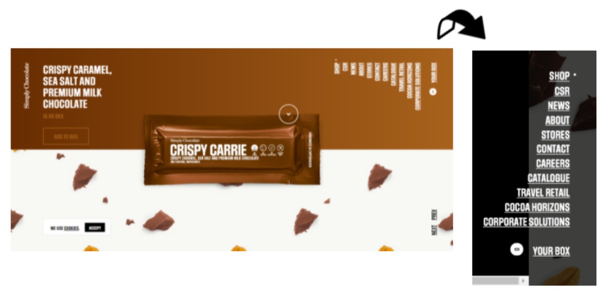
Take this website by Simply Chocolate, for example.
There are only a limited number of relevant pages, as you can see in the top right corner. This makes the website look more sophisticated and contemporary.
Avoid Duplicate Content
One thing that Google loathes over irrelevant content is duplicate content. Thus, when you are checking your website for SEO-friendliness, it’s best to make sure your website is clear of any sort of duplicate content.
It will only add to your problems.
Google makes you pay a huge penalty in case duplicate content is found on your website. Of course, your ranking will suffer. But the worst that can happen is your website’s removal from the index itself. Your business will no longer appear on the search engine result, taking away all the visibility.
You must have unique content at all times.
You might indeed have a local business spread across different locations or an eCommerce website with, say 15,000 product pages. But the same rule applies here as well.
We know it’s a task to identify and write unique things about your business like a home inspection business in New Orleans. But if you truly want Google to index your website and make it rank, you will have to work on relevant and different content for every single location page you are adding.
So, how does one identify and rectify this duplicate content issue? Let me help you out.
How to Identify Duplicate Content
Two types of identical content can be found – within your website and outside. To find duplicate content within your website, you can do the following.
1. Check your content manually using Google Search
One of the best ways to find identical content is to go for the most classic move – manual search.
Here, all you have to do is find the page or blog that you would like to check for duplicate content. Copy a few sentences from that page/blog and paste them into the search option of the search engine.
Make sure you add quotation marks (“”) before and after the sentence.
Once you click the search icon, you will either come across the blog or page with similar content or it’ll show no results. It will help you figure out if that particular page/blog is duplicate or unique.
2. Find duplicate titles and meta descriptions
Thanks to the introduction of digital tools, you can now easily find all the significant problems that your website might have concerning duplicate content and more.
The tool in the conversation here is called Visual SEO that received its well-deserved fame after Google decided to phase out HTML Improvements from its Google Search Console.
Visual SEO provides you with a report of all the issues related to your duplicate meta descriptions, page titles, H1 tags, and more.
Now, to find duplicate content outside your website, you can do the following.
3. Use plagiarism tool
Checking your content for plagiarism is one of the best ways to find identical content published by other websites.
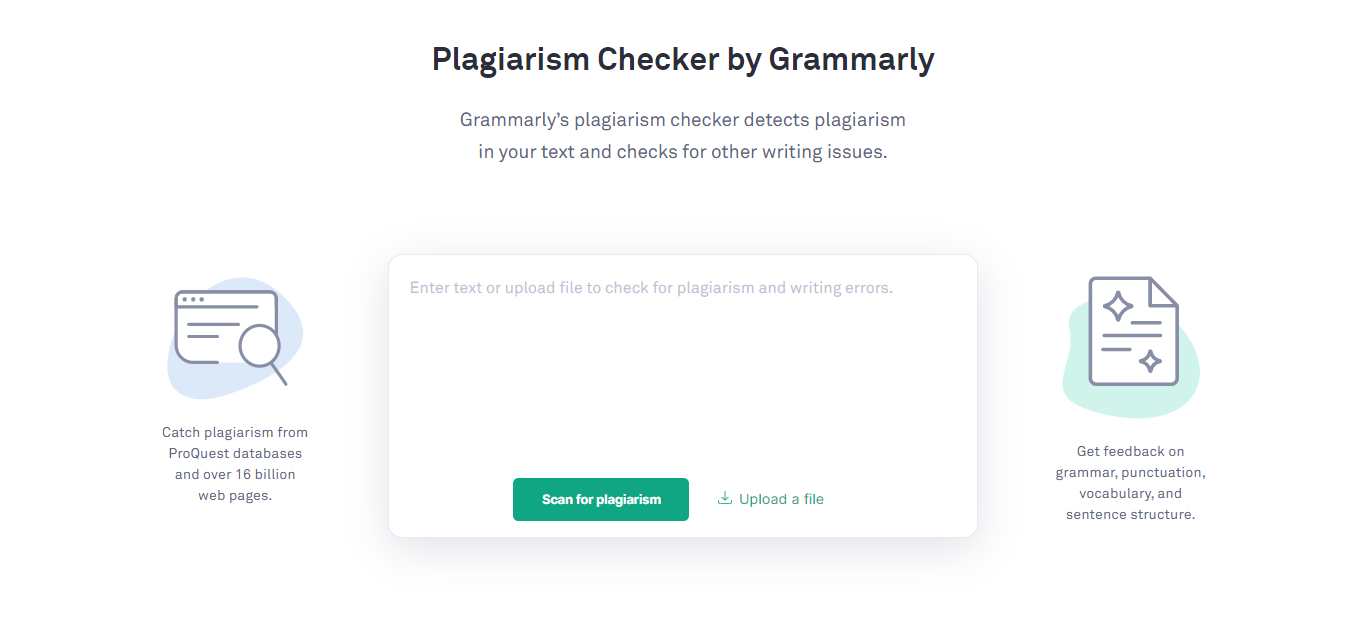
Tools like Grammarly and Plagiarisma are a few of the checkers that allow you to find duplicate and scrapped content.
̧You can simply copy and paste your content or upload your file to check for content that might be similar to something that’s uploaded on other websites on the web. The tools will highlight the content that is found on other websites and also provide you with relevant resources so that you can mention proper sources.
How to Fix Duplicate Content
If you have identified duplicate content on either your website or on that of the others, don’t worry. There are ways that you can use to rectify it.
1. Remove the content completely
Of course, the easiest way to deal with a problem is to get rid of the root cause. You can submit a legal request to remove the content on other websites that is similar to yours from Google completely.There’s a page that offers legal help in case of duplicate or copyrighted content. You will be asked to choose the Google product that your request is related to. It could be a Google Search, YouTube videos, Google Ad, Google Shopping, and more.Google also gives you an option to specifically choose ‘copyright removal’, if that’s the case. You can find the Digital Millennium Copyright Act Notice. All you have to do is provide the URLs of the copyrighted work (both yours and the infringed links), their team will verify the same, and you’re done.You will find the result in another couple of days, which is approximately 10 days.
2. Use meta-tagging
The signals and meta robots are two items that you can keep an eye out for when in search of identical content on your website.Meta robot tags are especially useful when you don’t want a certain page(s) to get indexed and show on the SERPs.It’s quite simple. You just have to add a ‘no index’ HTML code at the backend of the page.
3. Stick to one URL structure
Various structural elements of your URL can also be the reason for the presence of duplicate content on your website. If you don’t structure your URL in a way that it has certain instructions, then, whenever you create a different URL, it will always be a different structure and page.This is something that often occurs unintentionally but it can cause major problems in your core site metrics that include rank positions or traffic.The most commonly used structures that can easily get duplicated include www. and non-www. versions, HTTP and HTTPS versions, or the versions with and without trailing slashes ( / ).To rectify, you must identify which of the structures are most commonly used on your website and stick to it. If you are redirecting, make sure the pages are directed to those URLs that you want to get indexed and have the right structure.
4. Use canonical tags
Canonical tags are the crucial HTML code that keeps your content from getting duplicated – either on your website or outside.The code signals Google that you are the owner/publisher of the content. If the same content is found on other websites, your website will be considered the ‘main version’.Canonical tags can either point to a page or away from it. Tags that point to a page signals the search engine that the other version of the content is the ‘main version’.While the other one will inform the search engine that the page itself is the main version. These are also referred to as self-referencing tags. We will discuss more on these tags later.
5. Redirect duplicate page
This means redirecting your pages. They are extremely useful during the process of eliminating duplicate content.You can simply redirect the page with duplicate content to the main version of the page. This is especially an important practice when your duplicate pages have higher traffic volumes or authority.
These are the ways you identify and fix duplicate content to save your website from getting penalized.
Use Canonical Versions
We have discussed canonical tags in brief just above. Let’s go a little deeper into this practice and understand how using the canonical version will help you with your SEO-friendly web design.
The canonical tag is an HTML code that signals Google that the page with the code ‘rel=canonical’ is the main version. This is of importance majorly when you want to upload similar content spread across various pages but you don’t want all of them to rank on the SERPs. Instead, you only want just one of those similar pages to get a better rank (or at least get indexed).
This is a code that eCommerce stores with several product pages can find extremely helpful.
Yes, you shouldn’t use the same/duplicate content on your website, but when you have the same product available in different colors, it can often tempt you to keep it the same across these same product pages.
This is where a canonical tag becomes a blessing in disguise. This tag signals the search engines that the page with ‘rel=canonical’ is the main hero and the rest are just variations that can be sidelined. It helps you steer clear of getting penalized for duplicate content while saving you from spending time and effort in creating more content.
Now that you know what a canonical tag is or how it is beneficial, let’s find out a few best practices to make sure you are using it the right way.
Best Practices for Using a Canonical Tag
1. You must canonicalize your homepage
Backlinking is one of the most precious and crucial practices for your organic SEO. This means that you will have other websites linking to your homepage and it’s something that will be out of your control.Adding a self-referential canonical tag on your homepage will help keep you away from any problems that might arise in the future as far as duplicity is concerned.
2. Be clear with your signals
Sending mixed signals is never a good idea – whether it’s in your life or your SEO. So, what do mixed signals include when we are talking about a canonical tag? It means that you shouldn’t canonicalize page X to page Y and then, page Y to page X.Also, don’t redirect your page Y to page X once you have canonicalized page X to page Y. It will send mixed signals to the search engine and it will either avoid it completely or interpret incorrectly.Just keep the communication between the two pages one-sided.
3. Cross-domain canonicalization
If you have, let’s say, two or more websites and you publish similar articles across domains, you can canonical tag.The downside of using this tag during this situation is that only one of your domains (the one with the tag) will rank on the SERPs. It will prevent the other websites from being seen on the result page.You should use this only if it matches the nature of your business.
4. Test dynamic tags
This is a practice that is especially important for eCommerce websites or CMS-driven websites.Sometimes, if you add a bad code, it will create a new canonical tag for every other version of the URL. This dissolves the entire purpose of you adding the tag in the first place.Thus, you should spot-check your URLs to be sure that your codes are right and in place.
5. Canonicalize near-duplicates carefully
You don’t need to canonicalize pages that are exactly the same.Yes, there are still a lot of speculations around using this tag for those pages that have similar content but might have just a few different elements added. Product pages that differ in location or currency are one example.But it is completely sensible to use these tags for such product pages and get the main version ranked on Google.
Work on your URL
We have already touched upon how you should identify and stick to just one version of the URL structure.
Another thing that you should focus on when your URL is concerned is how do they look; what do they say. Now, this is something that hardly anyone ever focuses on.
When you don’t put much thought into your URL, they can end up reading like this – “https://www.websitename.com/product.aspx?ID=nWs13au=ZVmlntPSY=P2Xq”.
It looks so messy. Such URLs are bad for your users as well as the search engines, which are your two target points.
While we talk about your user, it will be hard for them to remember such a URL and come back to your web page when they want.
As for the search engine, Google takes your URL, meta tags, and your content into account to understand the topic that is being talked about. So, you see, URL plays a major role in SEO but it is still one of the most overlooked aspects.
You should be using an URL that is clear, concise, and describes what your page is all about.
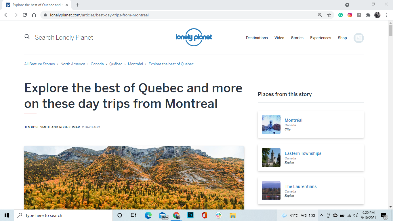
Take this travel website, Lonely Planet, for instance.
The URL that Lonely Planet has used for this particular page tells us exactly what the blog is all about i.e. best road trips from Montreal.
This is also a URL that users will find easier to remember.
Is keeping your URL simple the only practice to prepare your URL for SEO? Certainly not. Find a few practices to keep in mind below.
Best SEO practices for URL
1. Hide the prefixes
To make your URL more memorable and neat, you can eliminate the prefixes ‘www.’ and ‘https://’ in the address bar completely. There was a time when these prefixes were important, but they aren’t anymore.In fact, even Google hides their prefixes as it is not needed to be displayed because they have a secure icon. You can still look at the prefixes by just double-clicking on the URL in your address bar.
2. Use HTTPS
HTTPS is a more secure version of HTTP. It keeps the hackers away in case they try to trap and read the data.When you use HTTPS instead of HTTP, it makes your website look more credible to your users. Your users can induce trust in your website, especially when they are supposed to share their card details, address, or other personal information with that one additional letter.
3. Add keywords carefully
We discussed above that your URL needs to be clear because it helps Google understand the topic of the page. Now, you can add a keyword that is mentioned in the title of your page or blog post in your URL.It will make everything synchronized and also signal Google that your page has exactly what the topic is being searched for.Just make sure to not overstuff your URL with keywords as it will make it look spammy and will not work in your favor. Just one would do the job.A quick tip: You should also add this keyword to your meta description because Google will bolden your keyword which helps make your website stand out.
4. Use lowercase letters
You must keep your URL in lowercase because it gets case-sensitive once your domain name ends. So, let’s say your domain is websitename.com. If you search for WebsiteName.com, you’ll still come across websitename.com. However, if you search for websitename.com/Contact instead of websitename.com/contact, you’ll be redirected to a 404 page.So, if you are redesigning your website, make sure to update your URLs. Redirect them to new links. If you are just starting, keep it lowercase from the start.
5. Remove stop words
Certain words need not be a part of your URL. These are the stop words that include for, an, a, the, etc. The main reason to do this is to keep the URL crisp. This makes it more legible and memorable.The fewer words you add to your URL, the better.
6. Separate words with a hyphen
When you have two different words to add to your URL, it won’t allow you to add space in between. So, how would you keep these two words in your business name separated?It’s definitely not by using an underscore. The best way to ensure your website is SEO-friendly would be by using a hyphen in between the words. These hyphens simplify the URL name. It ensures that both search engines and users can read the name and understand where the breaks would be.For instance, www.websitename.com/seo-best-practices is much more legible and understandable than www.websitename.com/seobestpractices.
Focus on user experience
User experience has been the core of web design for decades. But now, thanks to the evolving algorithm, user experience has become a center for making the website SEO-friendly as well. The better the user experience, the higher are the chances of your website ranking on the search results.
You need to go beyond contrasting colors and the placement of buttons in your web design if you want Google to positively measure the UX signal of your website.
Google expects you to optimize your website to serve the needs of the users. One of these users is the search engine itself. This search engine then further helps other users on the web discover your content.
We have already covered plenty of points, and we have more coming up after this, on how you can improve the experience for search engines. Let us now focus on how you can make the experience better for your human users. Trust us, it goes beyond making your SEO web design mobile-friendly.
How to provide a good user experience for users and search engines
1. Consider website usability
Usability refers to the ease and user-friendliness of your website. It is an important part of the user experience because improved usability allows you to offer a positive user experience.You should have an intuitive approach when you work on the usability of your website. An intuitive approach circles the designs that are based on the concepts or principles that are already known to your user. For instance, when we look for a logo, we always glance at the top-left corner. Moreover, we expect the logo to be clickable and take us back to the homepage.Keeping these user mental modes in mind will help you design your website for your end-users.
2. Content hierarchy
Content is one of the most crucial elements of your website. And how it unravels and is organized can make all the difference.When considering both your end-user and the search engine, you should organize your content under subheadings. Just a plain, giant wall of text can get overwhelming.We are living in an era where time is never enough. And when you organize your content under a well-planned hierarchy, it helps make your content more skimmable. The more skimmable your content, the easier it will be for your users to find what they are looking for on your website.Adding subheaders also allows Google to understand what your topics are talking about.Use multiple heading tags to organize your content in a more hierarchical structure. Your H1 is your main title, H2 is an important subheading, H3 is a crucial sub-sub heading, so on and so forth.Just don’t go overboard with them. Your content should be categorized but still, maintain the flow.
3. Accurate title
By accurate title, we mean it should help you achieve two goals. And that includes:
- Describing the topic that you have covered on your web page
- Have the keyword that you are targeting
Make your title descriptive, catchy, and helpful. They should be able to set the user’s expectations right even before they have opened the link.
As for the keyword, for Google, it plays a very crucial role. Title tags are one of the important ranking factors. Moreover, when you add a keyword to a descriptive title, your users will be able to find what they had been searching for in the first place.
4. Natural language processing
Gone are the days when Google had to hand-code their algorithms. They would adopt the trial and error method and run extensive tests to find the solutions that improved search results.Then came the technological breakthrough. Of course, algorithm engineers are still a part of the cycle, but a machine learning algorithm (AI) named RankBrain was created to make things a little easier.This AI helps Google understand the topics that a web page circle and lets Google know what kind of search results do people expect to come across for particular search queries.An example of how RankBrain has helped Google is the introduction of the Passage algorithm. If you have noticed, Google now takes you directly to the section of a long web page that’s relevant to your user’s search query. Before the Passage algorithm existed, Google had some challenges in ranking long web pages.This shows that new technological updates at Google make sure that users are reaching the web pages that have required content and not the relevant keywords. It is now matching the answers to the questions that are being searched for and not the keywords.Thus, if you add content that is truly valuable and credible, you are good to go.
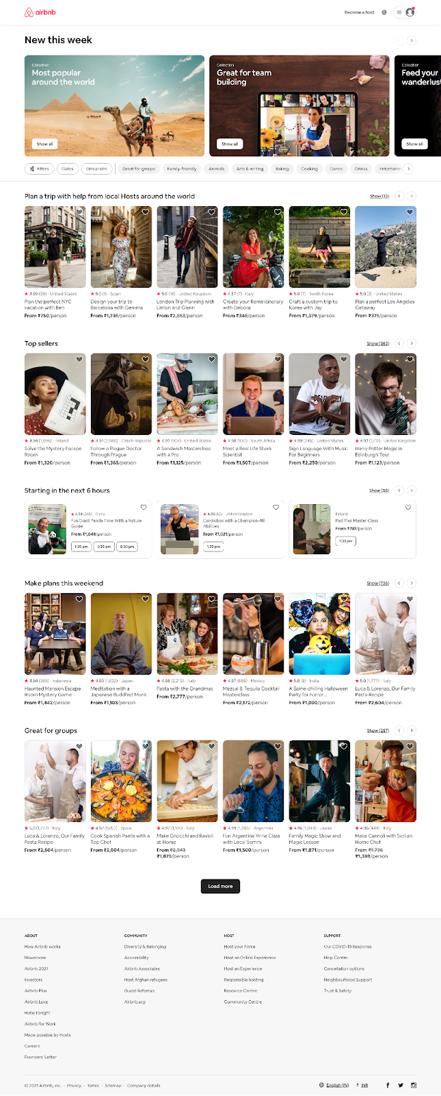
Take a look at this website by Airbnb. It has everything that is needed to offer a positive user experience. They have minimal text, search option right at the top, logo to the left that brings one back to the homepage, and the content is added under a well-planned hierarchy, among many other usability features.
Make Pages Indexable
If your pages are not indexable, they won’t rank. It’s as simple as that. Thus, it is extremely important that you make your web pages fully indexable.
Your page would be ‘indexed’ on Google if it is visited by the crawler, examined for the content available on the web page, and then stored on the index. If your website follows the guidelines by Google webmaster, it will be seen on the search engine results.
Take a look at these search results that rank for the keyword ‘best corporate gift suppliers in Australia’.
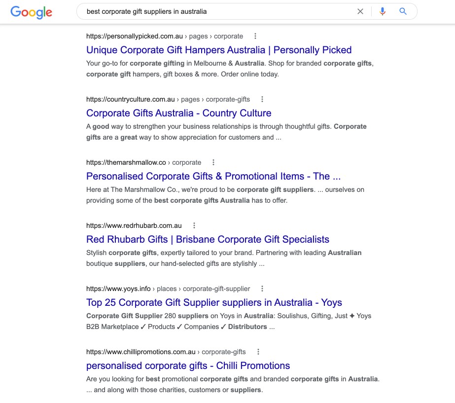
Here’s how you can make sure your page gets indexed.
Best Practices to Make Your Page Indexed
1. Hidden content
There was a time when websites had content hidden from the users but only visible to the search engines. For example, positioning content far off in the right such that it went off-screen.This was a famous spam technique to boost visibility when SEO was only dependent on a simple text matching algorithm.This led to the users having a poor experience as several websites had affiliate links. These sites only had keywords stuffed and no relevant information. The main purpose of such content was to create content for the SERPs. Nothing else.In today’s time, such a practice can lead to penalization. But don’t worry, there are ethical ways to hide content now.You can use hidden tabs instead of hidden text. Hidden tabs hide the content behind a ‘Read More’ signal. This gives the users an idea that there is more content but it is accessible after an additional click. So, it is there but it isn’t truly there. Hidden text, on the other hand, is completely inaccessible.So, you can hide content and still get indexed. It’s the best of both worlds!
2. Add alt text
Alt texts are underrated.It is impossible for search engines, including Google, to identify an image. They won’t know what is there in an image if you don’t make them understand.That’s where alt text comes into the picture. An alt text is a description of the image that is added to a web page. It is added for the times when the user’s internet is so slow that it fails to load an image and instead, text appears on the screen. Or, for those with disabilities, who are using a screen-reader to go through the web page.Using alt texts that describe the image thoroughly helps Google understand what the image is about and consequently, what the entire web page is all about. This improves the chances of your web images indexing and ranking on the Google Image results for search queries that are entered by the user.
3. Add transcripts
If Google cannot understand images, it certainly cannot understand videos or audio either. So, what do you do to signal the search engine? You add the video or audio transcripts.When you add a blog, the search engine can crawl your title, subheadings, content, everything. But when it comes to a video, you have a title and maybe a short description and that’s about it.Adding a transcript changes things.The search engine will be able to crawl your transcripts and index your videos/audios accordingly.It also offers a great user experience as not many can understand every accent. If they have the content written in front, they will be able to enjoy the video more.
4. Spot check your backend codes
There is a code that several websites use incorrectly and that’s the ‘noindex’ code. This is a meta tag that signals Google to not index a certain page.Many websites have used this meta tag on several important and big chunks of web pages. And that’s just wrong. It’s a wastage of the time and effort that you’ve put into the content on those pages.This is a code that is majorly used for those pages that are only created to be used by internal staff or for web pages that are still under construction.So, to ensure your web pages get indexed, you should just do a thorough check of your backend tags.
Apply schema markup
Schema is basically a code or structured data that influences how content would be displayed by the search engines on the search results. It has no SEO benefit but it does help to improve the CTR of a website.
How to Use Schema Markup
You can add a schema code to certain pieces of information such as people, business names, email addresses, phone numbers, star ratings, reviews, and even business addresses.
When you add schema, it enables Google to display such contact information on the search results.
Let us take an example.
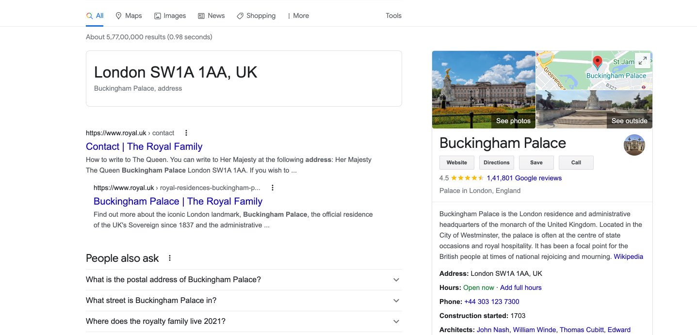
The search engine already knows that London SW1A 1AA, UK is alphanumeric. It’s a string of both numbers and letters. Now, if you add schema to these alphanumeric characters, it will make it easy for the search engine to learn that this is an address of an extremely significant landmark for the Englishmen.
Improve Site Speed

We have talked in length about how important the side speed is for those users who use a mobile phone to access your website. Does that mean you should leave out those that use a desktop? Certainly not.
Site speed has been a ranking factor since 2010, irrespective of the device. Google will always reward those websites that load faster than those that take hours.
Moreover, with the kind of patience and time we have today, users are more likely to abandon the search result altogether than wait for the page to load.
Wondering how you can improve your site speed? Here are a few ways.
Ways to Improve Your Site Speed
1. Decrease redirects
Yes, it is suggested that you redirect your duplicate pages but it will impact the speed of your site. Thus, as far as duplicate content is concerned, it’s best to avoid it.When you redirect a page to another page, your user is made to wait for additional time. At least till the time the HTTP request-response cycle is getting completed.With every redirected page, your website speed will get slower and slower.
2. Conduct image optimization
The size of the image can play a crucial role in optimizing the speed of your website. To make sure your website loads faster, you must ensure your image size is not larger than it is needed to be. The images should also be of a compatible format. You should also make sure they are compressed for the web.By using CSS sprites, you can develop templates for images/visuals that you think you use often on your website. These could include buttons and icons. With CSS sprites, you can combine all the images into one large image, making them all load at once. You can even choose what sections you would want to display.This leads to fewer HTTP requests that save a lot of time because users don’t have to wait for everything to load.
3. Optimize back codes
The codes – JavaScript, HTML, and CSS, can often get a little complicated. It is suggested that you minify these codes and optimize them to increase the speed of your website drastically.Optimizing such backend codes could include eliminating irrelevant characters, spaces, unused code, code comments, and commas. It could also include making changes to the formatting of the codes.
4. Improve server response time
There are quite a lot of factors that affect the server response time.The resources each page takes, the amount of web traffic, the software your server utilizes, and also the hosting services you are currently using are a few of those factors.Whatever you need to do to improve your server response time has to do with these factors.Try and identify the performance blockages. These could be slow routing, slow database queries, or even inadequate memory. Once you have identified, take measures to fix these issues and work on your site’s speed.
5. Distribute content load using tools
You can leverage tools like a content distribution network to distribute the load of delivering web content. Content delivery/distribution networks are primarily a network of servers.These enable you to store your web copy at several geographically assorted data centers, giving your users faster and reliable access to the content that is available on your website.
Content guide
Just to recap a bit, as far as content is concerned, we have talked about mobile-friendly ways to upload content, jump links, hierarchy, and even the cons of duplicate content.
But what type of content should you be talking about on your website? How should the same be displayed?
This is where the content marketing funnel and information architecture play a major role. Let’s first discuss the funnel.
Content funnel
The job of your SEO web design is to not only make your website get indexed and rank in front of your prospects but also keep them engaged. Otherwise, it won’t solve any purpose.
If your users visit your website and stick around, it signals the search engine that users are finding your content relevant and valuable. That’s why they are spending time on it. It further boosts your site’s visibility on the SERPs for the keywords you are targeting.
To do this, you need the right content.
When a user lands on your website, they should be able to find what they are looking for, irrespective of the customer journey phase they are in. These phases include Awareness, Consideration, and Conversion.
If you follow this marketing funnel, it will improve your chances of getting in front of customers who might already be considering taking services similar to yours. When done right, it improves your chances of converting such customers.
Here’s how a typical marketing funnel and the content related to it works –
For the Awareness stage (top of the funnel)
The main aim of the content at this stage is to help your customers identify and understand the problems they face. This is also the stage where you would showcase your credibility and experience to solve such problems.
The content that you can add at this stage includes:
- Webinars
- Blogs/Articles
- Comprehensive Guides
- Frequently Asked Questions
For Consideration stage (middle of the funnel)
The content that your prospects read during this stage helps them compare your services with that of the other similar businesses available in the market.
Thus, it is best if you could upload content that is practical and straightforward.
The content that you can add at this stage includes:
- Product demos (videos, preferably)
- Detailed case studies
- User guides
- Information about your product or service
For the Conversion stage (bottom of the funnel)
This is the stage where you gently push your customer to make the purchase from your business.
The content that you can add at this stage includes:
- Free trials or consultations
- Testimonials
- Reviews and ratings
When you add the right content for the right stages, it helps users find exactly what they are looking for on your website. As a result, they spend more time on the pages, thus, reducing the bounce rate on your website.
Now that you have an idea about what type of content you can add, let’s discuss how you can add it.
Information Architecture – Structure and Best Practices
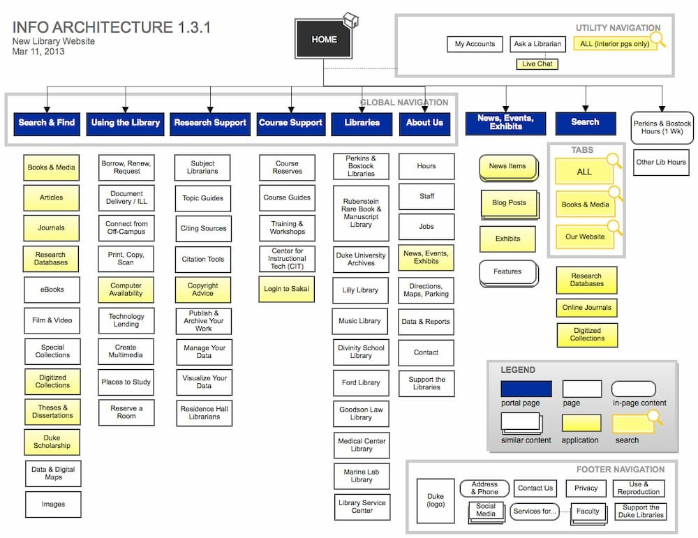
The way you organize and structure your content on your website is the information architecture. It is one of the most crucial aspects of SEO web design because it is this structure that enables users to easily adjust to the functionality of the website.
Information architecture helps visitors to find what they’ve been looking for, without putting in too much effort. This structure is used by the UX designers as a blueprint to develop a navigation system across the website.
To offer a good user experience, you need good information architecture. Here’s how you can do it.
1. Challenge your biases
One of the biggest challenges that designers face is moving on from their preconceived beliefs and assumptions. These notions can often make the designer believe that they know better.However, you should rely on research and observations when it comes to design. It is only then that your information architecture will be designed for users and not for yourselves.
2. Don’t just stick to wireframes
Web designers need a blueprint. That’s true. They need a sitemap and wireframes to design the website. But it is now crucial to make the customer journey an integral part of it.You need to dive deep and understand who your audience truly is, what are their needs, challenges, and pain points. More importantly, what are they looking for on your website.Go beyond wireframes and structures when planning how you will unravel your information. It will give you a better idea of what should come first.
3. Work on the hierarchy
Hierarchy is the arrangement of the design elements on your web page.This hierarchy will help you arrange your content based on the eye-movement patterns of human beings. It means you would want to keep the most important elements at the points where the eyes go naturally.For example, for Westerners, who go from top to bottom and left to right, it is best to use a Z-shaped or F-shaped pattern. You can use a heat map to find the most visited spots on your web page.
4. Know your IA principles
There are eight principles of information architecture that you should have at your fingertips. These are principles of:
- Exemplars: Help users understand what content they should expect by providing them with examples.
- Growth: Prepare your information architecture for scalability for the time as and when your business grows.
- Focused Navigation: Instead of placing everything in one place on your website, provide the users with focused navigation ways to access your different content assets.
- Choices: Offer meaningful and relevant choices to your users.
- Objects: Your content should be unique. It should have different characteristics and should not resist change at any given point in time.
- Disclosure: Offer just enough information that gives the users an idea of what they will find if they keep navigating your website.
- Multiple Classification: Not everyone searches using the same query. Make sure your content is classified in a way that your users are able to find what they are looking for, irrespective of what they search for on your site.
- Front Doors: Not every user will enter your website through the front door i.e. the homepage. Every page should help users navigate your website easily.
Conclusion
We hope we have covered everything that needed to be covered. But if you still feel we missed out on certain elements or practices, or if there’s something that you do differently, we would love to know about that. And we are sure others reading this blog would do too. Drop your comments in the section below and let’s get chatting.

