Table of Contents
- Introduction
- Understanding Conversion Rate and its Optimisation
- Create compelling CTAs and place them at optimal
points - Enhance user journey by placing visual
content on landing pages - Ensure coherence between your ads and landing pages
- Closing thoughts
Introduction
The success of your online strategy is largely dependent on this term – “conversions”. Despite visibility and traffic, your business might not gain success if you are unable to convert those potential users into actual consumers. So your online efforts boil down to how effectively you are translating the incoming traffic into buyers. This is where conversion rate comes into play. Let’s first understand what it means.
Understanding Conversion Rate and its Optimisation
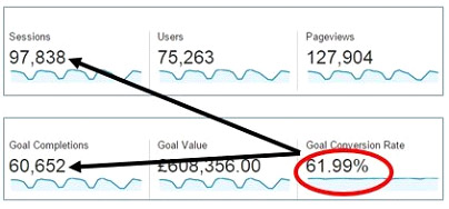
The conversion rate is an indicator of how well your website is converting potential customers when they visit your site. Conversion rate, in exact terms, is the ratio of total visitors to visitors who perform a desirable action.

In fact, this is a metric which directly reveals how your site is performing and if your business is generating profits. So it is crucial to optimise your marketing strategies in a way that they boost your conversion rate. Here is what you should be doing:
1. Create compelling CTAs and place them at optimal points
Call-to-action buttons are the most crucial element on any site because they ultimately lead the customer towards the purchase. So when it comes to getting more conversions, well written and well placed CTAs matter a lot.
Additionally, with mobile optimisation gaining more significance with mobile-first indexing, it is essential to remember that CTA design needs to keep mobile at its core else you might end up losing your potential customers coming through mobile devices. When you’re optimising CTA for mobile, it makes sense to keep the CTA in the first visible fold of the page or provide directional cues to take the visitor to the CTA button where he can
2. Enhance user journey by placing visual content on landing pages
A video on a landing page can increase conversion by 80%. So when you are focusing on increasing your conversions, it is essential that you pay attention to including visual content.
Since the attention span of the people is not greater than 8 seconds, it is almost impossible to hook them without using visuals.
3. Ensure coherence between your ads and landing pages
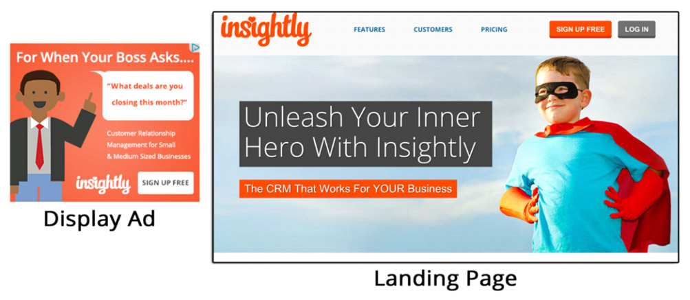
For your landing page to boost your conversion rates and sales, it is imperative that there is a relevance between the ad/other content that brings the user to that page. Without a coherence between these two elements, your landing page won’t help you achieve your goals.
This uniformity should be kept in terms of both the design as well as the content. For the design aspect, make sure to keep a uniform color palette. For the content part, ensure that there is a sequential move from the point of origin to the landing page.
Here is an example:

Closing thoughts
Conversion rates are a direct measurement of your site’s success. To enhance this value, make sure to put down the above points in your 2021 checklist.


